
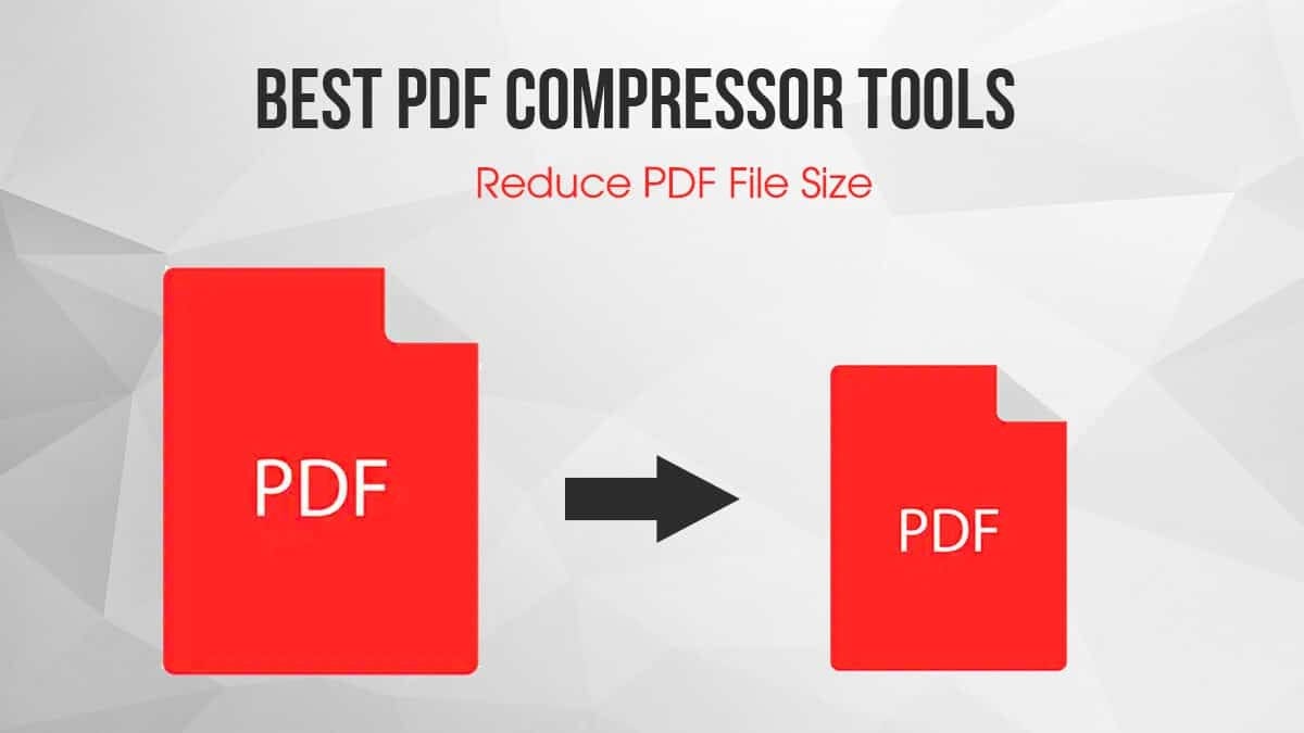
Bloated PDFs waste inbox space, stall uploads, and make busy people wait. Shrinking them is easy – until the text turns fuzzy, tables blur, and stamps look like smudges. The fix is a cleaner workflow, not a magic slider. When you control how pages are built (scan settings, image treatment, fonts, and OCR), you can cut megabytes without touching readability.
This guide shows the moves that matter: what actually bloats a file, how to set the right scan and export options, and a repeatable routine you can run in minutes. One short checklist sits in the middle so you can apply it on any device or tool.
Why PDFs bloat – and where quality gets lost
Most oversized PDFs come from three culprits: images saved at print-poster resolution, photos kept in full color when grayscale would do, and repeated assets (logos, stamps) embedded again on every page. The rest is noise: unused metadata, invisible layers, and forms that carry extra objects you never view.
Keep the goal simple: make text render as text (via OCR), photos live at a sane resolution, and graphics reuse shared objects instead of clones. That’s how you get small files that still look clean on screens and printers.
If you like to keep a neutral bookmark while you work – so you don’t wander through tabs – drop a quick reminder link like desi bet in your notes. Open it, take a breath, and return to the steps here. Calm beats rushed clicks when you’re handling scanned paperwork.
Scan settings that actually help
Think in content types, not tools. Contracts, invoices, and forms are line-art plus text; they like grayscale at 300 dpi, OCR on, and lossless compression for the text layer with gentle JPEG for any photos. Brochures and reports mix photos and vector shapes; they like 300 dpi images, fonts embedded as subsets, and vector graphs left as vector – don’t rasterize them unless you must.
Phone scans are fine if you control light and angle. Shoot on a flat, evenly lit surface, fill the frame, and let the app’s perspective fix do its work. Turn flash off (it creates hot spots), hold steady for a second after the capture, and don’t stack multiple filters; every pass adds noise that the compressor will try – and fail – to hide.
OCR: why it shrinks files and makes them useful
OCR isn’t just about search. It lets the compressor treat glyph shapes efficiently and avoid storing every page as heavy pixels. It also unlocks highlights, copy-paste, and screen readers. If accuracy looks off, switch the language pack, add a short training dictionary for names you see often, and keep the original image behind text for legal comfort. For handwriting, set expectations: OCR will miss cursive; add a small typed note or index page so future searches still find the file.
When “quality loss” is invisible – and when it isn’t
Lowering image resolution from 600 to 300 dpi on a scanned letter is invisible at normal zoom and halves weight. Shifting a color photo from lossless to an 80% JPEG often cuts size by 60–70% with no visible change on screen. But pushing JPEG below ~60% can introduce blotchy gradients and haloing around stamped text. The rule: compress until artifacts appear, then step one notch back. Always test on the worst page – the one with tiny seals or light gray text.
Line art is sensitive. Keep stamps and signatures as true black shapes or high-resolution monochrome images; don’t let them become low-res gray smears. If your tool offers mixed raster content (MRC), use it: it stores text as clean masks and photos as separate layers, giving smaller files and sharper edges.
Naming, security, and delivery that avoid rework
A tidy file is more than small. Name it for the human who needs it: 2025-09-15_Contract_SinghCo_Signed.pdf beats scan(44).pdf. If you must share externally, add a light open password only when policy demands; heavy encryption blocks preview in many portals and inflates size. Strip metadata that leaks personal data (camera model, GPS) from phone scans before you email them.
For large bundles, use one PDF with bookmarks instead of many attachments. It’s easier to review, and the optimizer has a better shot at deduplicating assets. When a portal limits size, aim for 100–300 KB per text-heavy page as a quick rule. For photo-heavy brochures, 400–700 KB per page is common.
Troubleshooting the usual “why is this still huge?”
- Pages look like photos even after OCR. Your tool didn’t keep the text layer; re-export as “Searchable PDF” with “keep original image” checked.
- Fonts balloon size. You embedded full families; switch to subset embedding and remove unused fonts.
- Logos repeat on every page. Enable “detect duplicate images” in the optimizer.
- Everything is sharp but heavy. Downsample photos to 150–200 dpi for screen-only versions and keep a separate print master at 300 dpi.
- Tiny stamps vanish on print. Raise line-art resolution to 600 dpi and keep it lossless; don’t raise photo quality.
Wrap-up
Small, readable PDFs come from choices you control: scan at sane dpi, convert pixels to text with OCR, downsample photos intelligently, and deduplicate what repeats. Save a preset for each document type you handle, test one page at high zoom, and ship with a name the recipient will recognize. Do that, and your files will load fast, print cleanly, and stop clogging inboxes – without a single fuzzy line.